by Nick Throlson | Dec 31, 2023 | Web Design, WordPress
Your website is the digital storefront for your brand, and its design plays a critical role in creating a positive first impression, as well as in driving user engagement and converting visitors into customers. Designing an effective WordPress website demands a comprehensive understanding of essential best practices that contribute to a seamless and captivating user experience. With countless WordPress themes and plugins available, it can be challenging to determine which combinations will offer the most value for your specific needs.
In this blog post, we will unveil the top 10 best practices for effective WordPress website design, focusing on elements such as layout, navigation, typography, color schemes, and responsiveness. We’ll also discuss the significance of performance optimization, security, search engine optimization (SEO), and engaging multimedia to create a functional and visually appealing website that exceeds your user's expectations.
1. Prioritize a User-Friendly Layout and Navigation
Your website's layout and navigation should be intuitive, clean, and easy to understand. A well-organized structure enables users to quickly find the information they seek, ultimately enhancing their overall experience. To achieve this:
– Use a clear hierarchy that reflects your site's content organization
– Employ consistent menu structures across all pages
– Ensure easy access to important sections, like “Home,” “About Us,” and “Contact”
– Implement breadcrumbs for improved navigation through deeper pages
2. Choose the Right Typography and Legibility
Typography plays a critical role in conveying your brand's personality and fostering readability. Be deliberate with your font choices and ensure they align with your design aesthetics while also prioritizing legibility. Consider the following:
– Use fonts that are easy to read across devices; sans-serif fonts like Arial and Helvetica often work well
– Limit the number of different font families used for a consistent design
– Follow a hierarchical approach for font sizes to emphasize headings and main content
– Utilize line spacing, letter spacing, and adequate contrast to improve readability
3. Utilize Engaging Color Schemes and Visual Elements
Colors have a significant impact on user perceptions and emotions. They can either unify your design or create dissonance. Select color schemes that are consistent with your overall branding and enhance user engagement. Remember to:
– Use a primary color palette of around 2-3 colors, with complementary or contrasting shades as accents
– Ensure suitable contrast between text and background colors
– Leverage white space strategically to create a sense of balance and emphasize important content
4. Implement Responsive Design: Cater to All Device Types
With the proliferation of mobile devices, creating a website that provides a seamless user experience across screen sizes is crucial. Responsive design ensures that your website adapts to various devices without compromising its aesthetics or functionality. Incorporate the following best practices:
– Choose a responsive WordPress theme or use plugins like WPtouch for mobile optimization
– Test your website on different devices and browsers to ensure a consistent experience
– Employ mobile-friendly navigation systems, such as collapsible menus or “hamburger” icons
5. Optimize Website Performance and Loading Speed
A slow-loading website deters visitors and ranks lower in search engine results. Performance optimization is vital for delivering a satisfying user experience and enhancing your website's search engine visibility. To optimize your website's performance:
– Use a reputable hosting provider for improved server response times
– Compress images and multimedia elements with tools like Smush, TinyPNG, or ShortPixel
– Utilize caching plugins, such as WP Rocket or W3 Total Cache
– Minify CSS and JavaScript files using plugins like Autoptimize or Async JavaScript
– Use downsized small files for high quality photos videos that you can create with a professional video production company.
6. Employ SEO Best Practices for Improved Visibility
An effective WordPress website design must incorporate search engine optimization (SEO) practices to enhance its visibility in search results. Utilize on-page SEO strategies to help search engines understand your content better. Some notable practices include:
– Including target keywords in titles, headings, and content
– Crafting descriptive and unique meta titles and descriptions for each page
– Using an SEO plugin, such as Yoast SEO or RankMath, to monitor and optimize your content
– Implementing internal linking to connect relevant content and provide additional value to users
7. Integrate Engaging Multimedia Elements
Well-curated images, videos, and other multimedia elements add value to your content, engage users, and enhance your website's overall aesthetics. To optimally utilize multimedia:
– Ensure image and video files are of high quality but compressed for faster loading
– Utilize relevant alt-text and titles for images to improve SEO and enhance accessibility
– Embed videos from established platforms like YouTube or Vimeo rather than self-hosting, which may slow down your site
8. Emphasize Accessibility for Enhanced User Experience
An accessible website ensures that all users, including those with disabilities, can engage with your content effortlessly. Prioritizing accessibility not only improves user experience but also enhances your website's SEO. Some accessibility best practices include:
– Providing clear and descriptive link texts
– Ensuring keyboard navigation for all interactive elements
– Including alternative text for images and multimedia content
– Offering appropriate contrast levels between text and backgrounds
9. Maintain a Consistent Brand Identity
A consistent and cohesive design across your entire website helps cultivate trust in your brand and ensures users feel comfortable and familiar when navigating your site. Consistency can be maintained by:
– Utilizing a style guide to standardize typography, colors, images, and other visual elements
– Ensuring consistent navigation structures and layouts throughout your site
– Reflecting your brand identity in both written and visual content
10. Regularly Update and Maintain Your WordPress Website
A well-maintained website ensures its security, functionality, and performance remain optimal. Regular updates also convey professionalism and dedication to providing an exceptional user experience. To achieve this:
– Keep your WordPress platform, themes, and plugins updated
– Regularly review your website’s analytics to identify areas for improvement
– Scan your website for security vulnerabilities and implement suitable measures to address them that could include using to ensure that no cybercriminals are able to use these vulnerabilities to cause issues for your business.
By incorporating these best practices into your WordPress website design, you will deliver a captivating and effective user experience, ultimately amplifying your online presence and boosting conversion rates.
Conclusion
Creating a highly effective and engaging WordPress website involves a combination of strategic decisions and meticulous attention to detail. From user-friendly layouts to performance optimization and consistent branding, these best practices lay the groundwork for an exceptional online presence that captivates your audience and generates results.
Enlisting the expertise of a professional WordPress web designer like Nick Throlson ensures that your website is built on a solid foundation tailored to your unique business needs. With unparalleled design solutions and a dedication to delivering exceptional results, your website will not only look remarkable but also optimize user experience, foster engagement, and boost conversion rates.
Ready to transform your WordPress website into an influential and powerful digital presence? Schedule a consultation with Nick Throlson today and elevate your website to new heights with professional web design services tailor-made for success.
by Nick Throlson | Dec 18, 2023 | Web Design
An inclusive, accessible website is the cornerstone of a successful online presence. Ensuring your WordPress site is accommodating to users with diverse abilities and disabilities is not only the right thing to do but also an essential means of boosting your site's usability and engagement. By embracing accessibility principles in your WordPress web design, you can create a welcoming environment for a broader range of users and enhance your brand reputation.
In this article, we'll delve into the significance of accessibility in WordPress web design and offer practical tips and strategies for creating websites that cater to users with various needs. From themes and plugins to design elements and content structure, we will explore the steps you can take to make your site more user-friendly, engaging, and accessible to all.
Stay tuned to uncover the secrets to a truly inclusive WordPress website that not only stands out in the digital landscape but also provides an exceptional user experience to everyone who visits.
1. Understanding Web Accessibility
Web accessibility refers to designing and developing websites, applications, and tools in a way that they can be used by people with varying abilities and disabilities. By making your WordPress site accessible, you enable individuals with visual, auditory, cognitive, motor, and speech impairments to navigate, understand, and interact with your content.
According to the World Health Organization, over a billion people globally live with some form of disability. Embracing accessibility in web design not only brings ethical and social benefits but also caters to a considerable market segment, potentially broadening your outreach and boosting user engagement.
2. Choosing Accessible WordPress Themes
Selecting an accessible WordPress theme is the first step toward ensuring an inclusive web experience for all users. The WordPress Theme Directory offers numerous accessibility-ready themes that have been designed and reviewed according to accessibility guidelines and best practices.
When browsing through the options, look for themes that adhere to the Web Content Accessibility Guidelines (WCAG) 2.1 set forth by the World Wide Web Consortium (W3C). WCAG 2.1 provides a comprehensive framework for designing accessible online content, focusing on four main principles: perceivable, operable, understandable, and robust.
3. Using Accessibility-Enhancing Plugins
Several WordPress plugins can help you enhance your site's accessibility and conform to WCAG guidelines. Some popular accessibility-focused plugins include:
- WP Accessibility: This plugin fixes several common accessibility issues and provides additional tools for enhancing keyboard navigation, font size adjustment, and high-contrast mode.
- One Click Accessibility: With a simple setup process, this plugin offers features such as a screen reader, contrast adjustment, and font size control, making your site more accessible to users with different needs.
- Accessibility Widget: This lightweight widget allows users to adjust the font size on your website at their convenience, improving readability for users with visual impairments.
Always update and test your chosen plugins to avoid compatibility issues and ensure optimal functionality.
4. Applying Accessible Design Practices
In addition to well-structured themes and plugins, applying accessible design practices manually to your WordPress site ensures that your content caters to a diverse audience. Here are some design principles to follow:
- Use meaningful alt text for images: Descriptive alt text provides context for users who rely on screen readers. When adding images to your site, write concise and informative alt text that conveys the image's purpose.
- Use high-contrast color schemes: Ensure that your text is easily distinguishable from the background, as it helps improve readability for users with visual impairments. WCAG 2.1 recommends a minimum contrast ratio of 4.5:1 for normal text and 3:1 for large text.
- Use clear and legible fonts: Select easy-to-read fonts and avoid overly decorative typography to enhance readability for users with dyslexia or low vision. A minimum font size of 16 pixels is recommended for body text.
- Avoid content flashing or blinking: Content that flashes, flickers, or blinks, especially at a fast rate, can potentially trigger seizures for users with photosensitive epilepsy. Eliminate such elements or ensure that they flash at a slower rate.
5. Structuring Content for Accessibility
Accessible content in your WordPress site should be structured in a way that enables smooth navigation and comprehension. Implementing the following practices can help you achieve this:
- Use proper heading hierarchy: Organize your content using appropriate heading levels (H1, H2, H3, etc.), which provide a clear structure that assists screen reader users in understanding and navigating your site.
- Provide clear link descriptions: Avoid ambiguous phrasing like “click here.” Instead, use descriptive and meaningful link text that clearly indicates the purpose of the link.
- Utilize accessible forms: Ensure that your forms include proper labels for each field and use features such as error messages and required field indicators to guide users in providing the correct information.
- Prioritize keyboard navigation: Many users with disabilities rely on keyboard navigation rather than a mouse. Ensure that your site is fully navigable using the keyboard, with features such as skip links and visible keyboard focus indicators.
By integrating accessibility principles into your WordPress web design, you can create a user-friendly and inclusive website that caters to the diverse needs of your audience. Remember that accessibility should be an ongoing priority, and consistently monitoring and updating your site according to best practices is vital for maintaining a welcoming online space for all users.
Empower Your Online Presence with Accessible Web Design
Embracing accessibility in your WordPress web design is crucial for catering to the diverse needs of all users and creating an online space that is both welcoming and functional. By choosing accessibility-ready themes, utilizing helpful plugins, and implementing thoughtful design and content practices, you can make your website more inclusive and ultimately boost user engagement and satisfaction.
However, constantly adapting to accessibility standards and best practices can be challenging. That's where Nick Throlson comes in – with extensive experience in designing and developing accessible WordPress websites, Nick will help you create an online presence that is both visually appealing and user-focused.
Don't miss out on connecting with a broader audience – schedule a consultation with Nick Throlson today and take a decisive step towards fostering a more inclusive and engaging WordPress website design that benefits users and bolsters your online brand.
by Nick Throlson | Dec 10, 2023 | Web Design
In the world of web design, versatility and functionality are crucial. As a versatile platform, WordPress offers a vast library of plugins that can significantly enhance your website’s functionality and design. Whether you're aiming to improve your site's SEO, increase your visitors' engagement, or ensure your site's security, WordPress plugins can do wonders to meet your specific needs.
Here at Nick Throlson, we specialize in amplifying your brand’s web presence, starting with a beautifully crafted, functional, and mobile-friendly WordPress website. In line with this, we understand how essential WordPress plugins are for enhancing your website and adding new features conveniently. Eager to share this wealth of knowledge with you, we have put together a comprehensive guide on leveraging WordPress plugins to take your web design to the next level.
This blog post will take you through a journey of exploring some of the most powerful and effective WordPress plugins that can transform your web design. These will range from plugins that simplify complex design processes to ones that add innovative features, enhancing your website's user experience. Additionally, we will provide a step-by-step guide on how to install and manage your WordPress plugins effectively.
By deep-diving into each plugin's capabilities, we aim to show you how they can provide solutions to your specific needs and enhance your web design strategy. Whether you're a budding entrepreneur keen on increasing your brand’s online visibility or a seasoned developer looking to streamline your design process, this post is for you.
Guiding you through the diverse world of WordPress plugins, we look forward to unraveling how these tools can empower your web design efforts. Ready for a transformative journey of increasing your website's overall functionality and design aesthetic with plugins? Let's dive in!
1. Beautify Your Site With Page Builder Plugins
A spectacular layout is often the cornerstone of an engaging website. Page builder plugins empower even the least experienced developers to craft visually stunning designs with user-friendly drag-and-drop interfaces. Here are a few popular page builders to consider:
– Elementor: An intuitive and feature-rich plugin, Elementor offers a variety of customizable templates, responsive design controls, and robust design features. With Elementor, achieve complex designs with minimal coding.
– Beaver Builder: Boasting front-end drag-and-drop functionality, real-time editing, and a variety of modules, Beaver Builder is known for its clean, lightweight code and developer-friendly features.
– Divi Builder: A versatile plugin, Divi Builder, grants access to a vast library of pre-built designs and modules, useful for various applications. Customize your site with ease, thanks to Divi Builder's intuitive visual interface.
2. Enhance User Experience With Navigation and Accessibility Plugins
A website's navigability is paramount to its success. Maximize user engagement by ensuring visitors can effortlessly explore your content. To improve website navigation and accessibility, consider these plugins:
– Hero Menu: Create customizable, responsive, and mobile-friendly menus with the Hero Menu plugin. Visitors will appreciate your sleek, user-oriented navigation, guiding them effortlessly through your site.
– Max Mega Menu: This plugin empowers developers to craft intricate menus with various styling options, widgets, and flyout menus. Enhance your site's navigation with Max Mega Menu's array of advanced capabilities.
– WP Accessibility Helper: Building an accessible website is a must in modern web design. WP Accessibility Helper offers accessibility options, including scalable font sizes, contrasted color schemes, and keyboard navigation.
3. Boost Engagement With Interactive Content Plugins
Captivate users and bolster engagement by incorporating interactive content. Images, sliders, and galleries can improve your site's aesthetics and user experience. Consider adding these plugins to enhance your site's visual appeal:
– Slider Revolution: Craft mobile-friendly content sliders and carousels with this popular plugin. Slider Revolution boasts an array of features, including dynamic content, responsive designs, and multimedia integration.
– Essential Grid Gallery: Showcase your content with an adaptable, filterable, and fully customizable grid layout. Essential Grid Gallery supports various media types, including images, videos, audio, and even posts.
– Envira Gallery: If you require a lightweight gallery plugin, Envira Gallery fits the bill. This responsive plugin features drag-and-drop functionality, appealing gallery templates, and customizable addons.
4. Secure Your Site and Improve Performance With Security and Optimization Plugins
Your site's speed and security can significantly impact user experience and SEO rankings. Enhance both by incorporating powerful security and optimization plugins:
– Wordfence Security: Secure your website against common threats with Wordfence Security. Features include a firewall, malware scans, login security, and more, ensuring your site remains protected.
– WP Fastest Cache: Boost your site's performance with WP Fastest Cache. This plugin creates static HTML files from your dynamic WordPress site, expediting load times and enhancing user experience.
– Smush: Large images can hinder your site's speed. Compress, resize, and optimize your images with the Smush plugin, improving loading times without sacrificing image quality.
Conclusion:
Crafting a well-designed, functional, and user-friendly WordPress website is an attainable goal when leveraging the right plugins. By utilizing a combination of page builders, navigation enhancers, interactive content tools, and security and optimization plugins, you'll create a stunning and engaging website that stands apart from the competition.
Remember, every plugin discussed in this guide was selected for its ability to elevate your website's design and overall functionality. Always strive to balance aesthetics with performance to ensure an optimal user experience.
As you embark on your web design journey with Nick Throlson, stay open to experimenting with various plugins and discovering which ones best suit your unique needs. By staying up to date on plugin developments and embracing innovative tools, you'll propel your website toward new levels of success. Ask us about our web design services!
by Nick Throlson | Oct 15, 2023 | Web Design
In an ever-expanding digital world, having a captivating and user-friendly WordPress website plays a crucial role in effectively conveying your brand's message, building customer loyalty, and increasing engagement. A beautifully designed, responsive, and highly-functional website not only reflects your brand's identity and values but also ensures a seamless browsing experience for your target audience. As web design trends and user preferences evolve constantly, staying up-to-date with the latest innovations and best practices is essential for maximizing the aesthetic and functional appeal of your website.
At Nick Throlson, our mission is to help you create captivating, responsive, and user-centered WordPress websites that resonate with your audience and convert visitors into clients. Our team of skilled web designers and developers is dedicated to providing you with the latest insights, guidance, and resources necessary for crafting visually stunning, engaging, and highly-effective website designs.
In this comprehensive guide, we will explore key principles, essential tips, innovative techniques, and recent trends in WordPress website design. From leveraging whitespace and mobile-first design to creating impactful visuals and utilizing cutting-edge typography trends, this article will equip you with the knowledge, strategies, and examples needed to create a standout web presence for your brand.
Alongside our design tips and techniques, we will also delve into the most popular and indispensable WordPress resources, such as themes, plugins, and design tools that aid in streamlining the design process and assisting you in creating visually and functionally optimized websites efficiently.
1. Leverage Whitespace for Enhanced Readability
Whitespace, or negative space, refers to the empty space that separates content elements, improves readability, and adds visual clarity to your website design.
- Enhance Legibility: Use ample whitespace around text, headings, and call-to-action buttons to ensure that your content is easy to read and doesn't feel cluttered.
- Focus on Content Hierarchy: Strategically place whitespace to guide users through your content and highlight important elements of your site.
- Maintain Responsive Design: Ensure that whitespace adjusts to different screen sizes so that your website is visually balanced and user-friendly across devices.
2. Implement Mobile-First Design Principles
With mobile devices accounting for a significant portion of web traffic, it's crucial to prioritize mobile user experience in your WordPress website design.
- Build for Mobile Screens: Design your website with mobile devices' smaller screens in mind and optimize elements like navigation menus, images, and typography for mobile users.
- Utilize Responsive Themes: Choose a WordPress theme specifically designed for mobile-first experiences, such as Astra, GeneratePress, or Divi.
- Optimize for Performance: Ensure that your site loads quickly on mobile devices by compressing images, using mobile-friendly plugins, and optimizing server response times.
3. Create Impactful Visuals for Captivating User Experiences
Visual elements can play a vital role in capturing users' attention, conveying your brand's personality, and enhancing user experiences.
- Choose High-Quality Images: Select eye-catching, high-resolution images that resonate with your target audience and reflect your brand's identity.
- Implement Visual Hierarchy: Organize your site's visual elements to emphasize key information and guide users smoothly through your content.
- Embrace Color Psychology: Strategically use colors in your website design to evoke emotions, create contrast, and support your brand's unique aesthetic.
4. Stay Ahead of Cutting-Edge Typography Trends
With typography being an essential aspect of web design, harnessing the latest trends and techniques can significantly impact your WordPress site's visual appeal and user experience.
- Choose Readable Typeface: Opt for clean, easy-to-read typefaces that are compatible with various devices and resolutions. Sans serif fonts like Open Sans, Roboto, and Lato are popular choices for modern designs.
- Implement Variable Fonts: Utilize variable font technology to enable smoother scaling, providing a customizable and responsive typography experience.
- Combine Font Styles: Pair contrasting fonts, such as a bold, eye-catching headline font with a simple, legible body text font, to create an engaging typographic hierarchy.
Conclusion
Crafting the perfect WordPress website design requires a deep understanding of essential design principles, innovative techniques, and current trends in responsive web design. By leveraging whitespace, prioritizing mobile-first design, creating impactful visuals, and staying ahead of cutting-edge typography trends, you can captivate your audience and create a visually stunning and engaging online presence.
In conjunction with implementing the tips outlined above, don't forget to explore the numerous WordPress resources available, such as themes, plugins, and design tools, which aid in streamlining the website design process and helping you create a visually and functionally optimized website.
As you embark on your journey toward mastering WordPress website design, keep an open mind, embrace new techniques, and stay informed about the ever-evolving digital landscape. Doing so will empower you to create a compelling, user-friendly, and visually arresting website that resonates with your target audience, stands out from the competition, and ultimately achieves your brand's goals. When it comes to WordPress development, trust Nick Throlson.
by Nick Throlson | Sep 11, 2023 | Web Design, WordPress

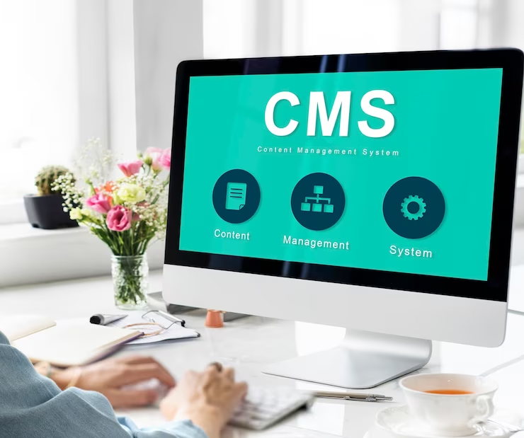
A strong internet presence is not just a luxury but a requirement in today's digital world. Content management systems have become the backbone of web development, allowing users to develop, manage, and customize their websites conveniently.
Choosing the suitable system from various options is challenging, so we have listed the 10 most popular CMS Platforms in 2023 to simplify your website creation options.
WordPress – The Undisputed Champion
It is a fantastic market leader, powering over 43.2% of all websites. WordPress is an open-source software well-known for its user-friendly interface, safety, and scalability. It helps its users to develop websites for different industries.
Pros:
● Access to a variety of free themes and plugins.
● Budget-friendly, with a wide range of prices available.
Cons
● Quality control varies among plugins and themes.
● Limited personalized customer support.
Best for
It is versatile, making it suitable for everyone. It can be used for everything from a personal blog to a sophisticated media hub like the online artist portfolio of Music.
Joomla- The Swiss Army Knife
It is a powerful and flexible system that runs over 2% of all web pages. Joomla has powerful functionality built in from the beginning. It can use multiple languages and powerful site management tools.
Pros
● It is an easy-to-manage platform for large websites with different navigation levels.
● Its two-factor authentication improves safety.
Cons
● The control panel may seem difficult at the start.
● Some of its plugins may not work well together.
Best for
The official Roger Federer website, which features portfolios, news, and a shop, is a prime example of the kinds of complex websites that Joomla excels at management.
Drupal – The Choice for Technical Prowess
It is a content management system that caters to experienced web developers by providing an adaptable API structure. This structure works with many different kinds of digital media. It is a popular option for high-traffic platforms because it prioritizes speed and security.
Pros
● Regular security checks strengthen defenses against vulnerabilities.
● Modules that are pre-installed increase a site's usefulness.
Cons
● Needs expertise in HTML, CSS, and PHP.
● Upgrades to new versions and other management duties can be time-consuming.
Best for
Drupal is best suited for technically savvy users who want to build expansive and intricate websites. The official City of Los Angeles website is a great example.
Magento – The E-commerce Powerhouse
Magento is an e-commerce platform designed specifically for larger websites that offers security, search engine optimization (SEO) friendliness, and extensive design flexibility. It is well-known for its ability to manage a large product catalog and numerous customer orders successfully.
Pros
● Support for several languages and currencies.
● Mobile-friendly content administration systems.
Cons
● The setup is complicated.
● Designing and listing products takes a lot of time.
Best for
Online retailers with moderate to substantial inventories perform best when using Magento. Olympus is a success story of this platform, which sells visual and audio products.
PrestaShop – Empowering Smaller E-commerce
This is an e-commerce CMS platform specially designed for small and medium-sized businesses. However, It also has a remarkable scale for large projects.
Pros
● Suitable for usage by people of varying degrees of expertise.
● There are numerous available plugins and themes for personalization.
Cons
● Scalability issues prevent rapid expansion.
● Expense-heavy reliance on improvements.
Best for
PrestaShop is a fantastic option for smaller and medium-sized online retailers like Harry Fay, a specialized jeweler in the UK.
Concrete5 – User-Friendly Simplicity
Concrete5's drag-and-drop content blocks and intuitive UI make it an excellent option for people who don't have a lot of experience with web development. However, it does not have auto-save features or a large community of developers.
Pros
● Easy to navigate UI.
● Integral seo features.
Cons
● Fewer programmers are working on software.
● There is no auto-save function.
Best for
ITV, a media conglomerate, is a good example of a major corporation that would benefit from a straightforward web design process.
Contentful – The Headless CMS for Future-Ready Websites
By isolating content from web pages, Contentful is a headless content management system. A more demanding learning curve and an increased requirement for technical knowledge go hand in hand with this portability between digital platforms.
With Contentful, businesses have understood its importance and have boomed the urge to use Headless CMS. Contentful brings in flexibility to achieve unique and feature-rich solutions with its futuristic development approach.
Pros
● Compatible with any electronic medium.
● Adaptable formats for content.
Cons
● Pay more attention to the app's structure and less to its visual design.
● Cross-platform content development calls for significant technological expertise.
Best for
As demonstrated by the Scandinavian Airlines System, Contentful comes into its own when utilized by businesses or people to build unique websites that share data across numerous digital channels.
Appy Pie Website Builder – Simplified Website Creation
Appy Pie Website Builder is a must-have tool for those just starting out or running a small business. The AI-powered, drag-and-drop interface makes it simple to alter looks and functions.
Pros:
● Web development powered by AI.
● A business email, a custom domain, and a mobile app are all part of a complete package.
Cons
● Not a lot of options for templates.
● Complex projects may have trouble with scalability.
Best for
It is suitable for those new to creating websites or running a business on a smaller scale.
Sitecore – The Enterprise CMS
It is a top enterprise CMS developed in ASP.NET. Its vast marketing tools and proficiency in creating content for many digital channels make it a good fit for enterprises of any size.
Pros
● Simple and straightforward design.
● Privacy regulations such as GDPR should be prioritized.
Cons
● Costlier than competing CMS platforms.
Best for
Huawei, a telecom equipment manufacturer, is a good example of a large organization that might benefit most from this.
Umbraco – The .NET Alternative
Open-source content management system Umbraco, built on Microsoft's. NET framework serves businesses with a wide range of content types. Scalability and security are strong suits, although it lacks a developer community and several plugins.
Pros
● Multi-channel content presentation flexibility.
● Rapidly patching security flaws.
Cons
● There is a scarcity of plugins.
Best for
Ideal for businesses with a wide variety of material, such as the extensive product and marketing information provided by Johnnie Walker.
Conclusion
A successful website structure requires careful consideration when selecting a content management system. These top 10 CMS platforms help everyone, from inexperienced users to seasoned programmers and from startups to multinational corporations.
However, your needs, technical knowledge, and available funds will determine the best course of action. You can confidently start your web development adventure with these robust platforms.
by Nick Throlson | Aug 16, 2023 | Web Design
Nowadays, having a mobile-friendly website has shifted from being an additional feature to an absolute necessity. According to statistics, over 50% of global web traffic comes from mobile devices, and this number is continuously growing. With so many people browsing the internet on their smartphones and tablets, it's crucial to ensure your website not only looks good but also functions smoothly across all devices. As a web design and WordPress specialist, Nickthrolson.com is here to show you how to achieve this level of mobile-friendliness.
Navigating a non-mobile-friendly website on a mobile device can lead to frustrating experiences, resulting in potential loss of leads and customers. Google has recognized the importance of mobile-friendliness, and they have implemented it as one of the significant ranking factors for websites. Websites that aren't mobile-friendly often suffer from a lower search engine ranking, which may affect their online visibility and turn away potential clients.
In this article, we will cover various helpful tips on improving your website's mobile-friendliness using WordPress. We will discuss responsive web design, which ensures your site adapts smoothly to different screen sizes and devices. We will discuss the importance of mobile usability elements like fonts, buttons, and navigation menus – all of which impact your website's mobile-friendliness significantly.
1. Implement Responsive Web Design
Responsive web design is a technique that allows your site to adapt to the different screen sizes and devices without compromising on design or functionality. It’s essential for all modern websites, and WordPress makes it easy to implement.
To create a responsive web design for your WordPress website, follow these steps:
– Choose a responsive theme: Starting with the right foundation is crucial. When selecting a WordPress theme, ensure it’s fully responsive by checking the theme description or previewing the theme on various devices.
– Use media queries: Media queries are part of CSS3 and allow you to create styles that apply to specific screen sizes or device types. Add custom media queries to your theme to optimize your website’s layout and design elements for various devices.
– Fluid grid layout: This layout ensures your website scales smoothly when the screen resolution changes. Replace fixed widths with relative units like percentages or ems in your CSS to maintain proportionate sizing.
– Optimize Images: Large image files can hinder page loading times. Use plugins like ShortPixel or Smush to compress images without loss of quality. By optimizing image sizes, your website will load quickly on all devices.
2. Enhance Mobile Usability
An essential aspect of mobile-friendliness is usability. Ensuring users can quickly navigate and interact with your site on any device helps create a pleasant experience. Pay close attention to the following elements to optimize usability:
– Readable fonts: Choose legible fonts and maintain an appropriate font size across your site. Implementing a base font size of at least 16px ensures your content remains comfortably readable across devices.
– Clear navigation: Mobile devices have smaller screens, making it even more essential to have clear, intuitive navigation. A common method is to use a “hamburger menu,” which collapses the site’s main navigation into a simple dropdown menu.
– Touch-friendly elements: Buttons and clickable elements should be large enough for users to tap with their fingers. Provide sufficient padding around buttons, ensuring at least a 44x44pixel touch target.
– Forms and input fields: Optimize forms for mobile devices by limiting the number of input fields and making sure they are large enough for users to enter their information easily.
3. Optimize Loading Times
Slow loading websites drive visitors away and can harm your search engine rankings. As an SEO best practice, it's essential to ensure your website loads quickly on mobile devices. Consider these optimization techniques:
– Minify CSS, JavaScript, and HTML: Minify your code by removing unnecessary characters, spaces, and comments. Plugins like Autoptimize or W3TotalCache can help you achieve this.
– Eliminate render-blocking resources: Some JavaScript and CSS files delay the initial rendering of your website. Optimize these resources by deferring non-critical JavaScript and inlining essential CSS.
– Use a CDN: Content delivery networks (CDNs) speed up the delivery of your website's assets by caching the content on servers located across the globe. Cloudflare and Fastly are popular CDN options worth considering.
4. Test and Refine
Lastly, regularly test your website's mobile-friendliness and make adjustments as necessary. Several tools can provide insights into your site’s mobile performance:
– Google’s Mobile-Friendly Test: This free tool analyzes your website and provides insightful feedback on its mobile usability.
– BrowserStack: It allows you to test your site on multiple devices, operating systems, and browsers, identifying any possible issues in real-time.
– Google PageSpeed Insights: This tool gauges your website's performance by analyzing loading times and providing actionable suggestions for improving its speed on both mobile and desktop.
– Google Search Console: Utilize the Mobile Usability report to identify usability issues and improve your site's mobile performance.
Conclusion
Improving your website's mobile friendliness is crucial for enhancing user experience, engaging visitors, and boosting your search engine rankings. By implementing responsive web design, optimizing usability elements, enhancing page load times, and continuously testing and refining your website, you can create an engaging and seamless browsing experience for users across devices.
Using the strategies discussed in this article will not only equip you to transform your existing WordPress website, but it will open up opportunities to attract and retain your audience in an increasingly mobile-first world. So, embrace these best practices and watch your brand thrive in the age of mobile optimization.